As my practice progresses, thoughts turn to how my work can be disseminated, who the audience are and what the end product will look like. The use of text plays an important role in my work and acts as an anchorage between walking routes and images and social qualities of place.
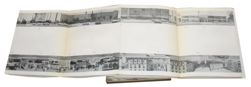
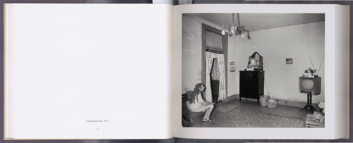
Creating a book was my first consideration. Certainly, when looking at the flow of travel, one immediately thinks of the books produced by Ed Ruscha such as “Every Building on the Sunset Strip” with its simplistic style and form allow the reader to move from one image to the next seamlessly. One is reminded of the early Zoetrope and imagine if one where to place Ruscha’s images into the drum you would get a sense of drive along the Sunset Strip. [Figure 1]
“The accordion format of the book, which suggests a temporal unfurling, mimics the sense of passage implicit in a drive. As the car rolls down the length of the street, it produces a series of images of contiguous spaces horizontally aligned.” [Mansoor 2005:online]
As a method of editing and testing the flow of images I created a Ruscha style, small handmade book, but the constraints of the page and need to turn each page interrupted the flow. I considered a foldout, this too wouldn’t fit with the twists, turns and dead ends of Bath.
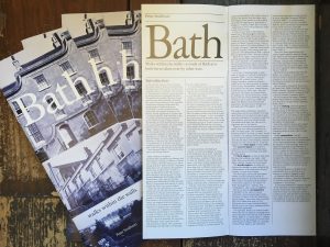
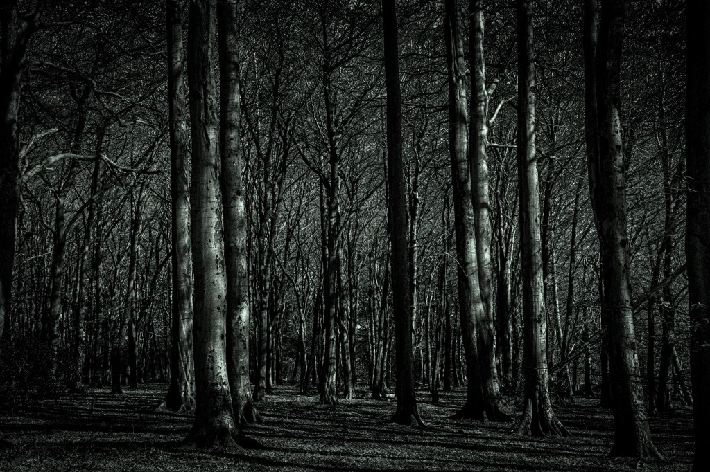
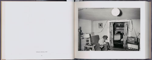
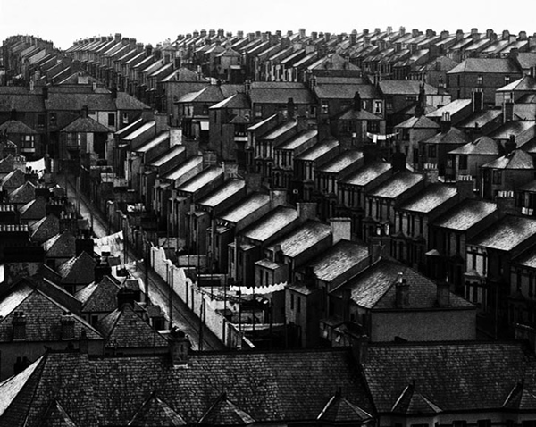
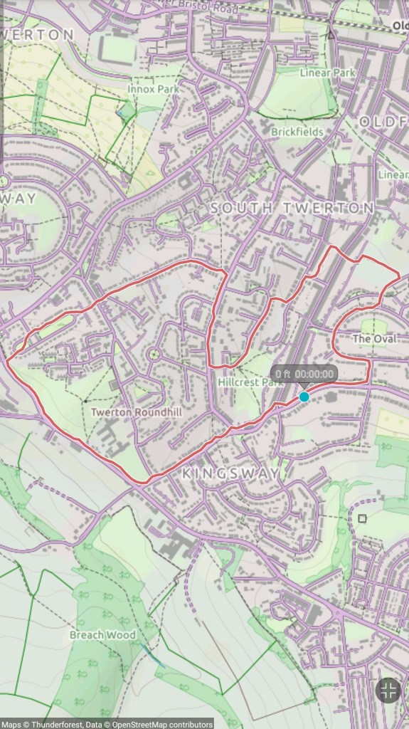
However, because of its topographic nature, Bath does not have this flow, with its maze-like roads, back streets and alleyways that create dead ends and cul-de-sacs. Each route is disjointed and more suited to walking, allowing for pause and reflection. This was something the architect Peter Smithson alluded to in his walking guide of Bath “Walks within the Walls” [figure 2]:
“The walks follow pedestrian ways and quiet streets as far as possible; for to see what there is to be seen one has to walk, one has preferably to be alone or with one other person, and one should not talk. The reverie that Bath can induce is an important part of the lesson.” [Smithson 1971:2]
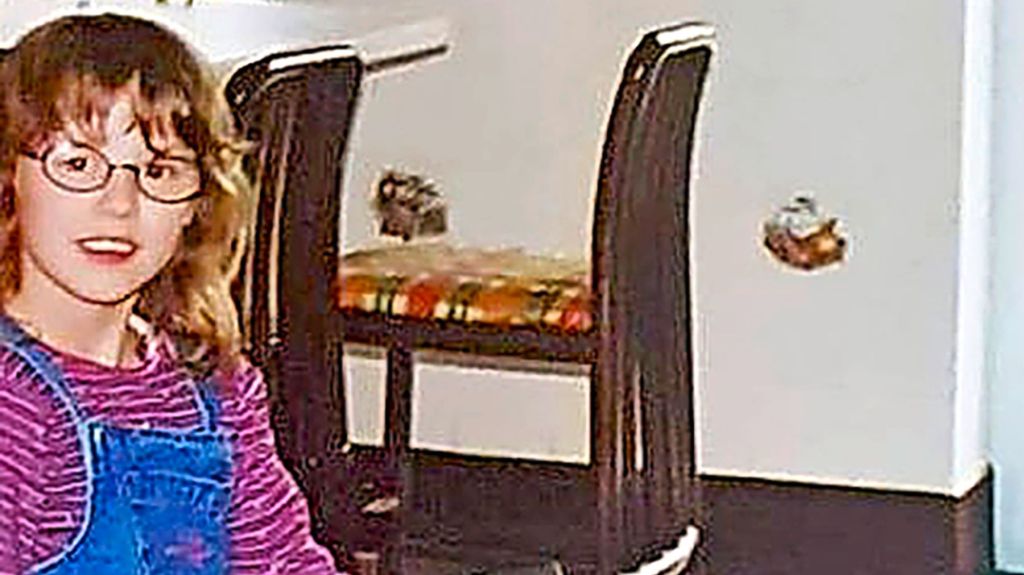
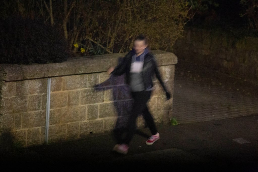
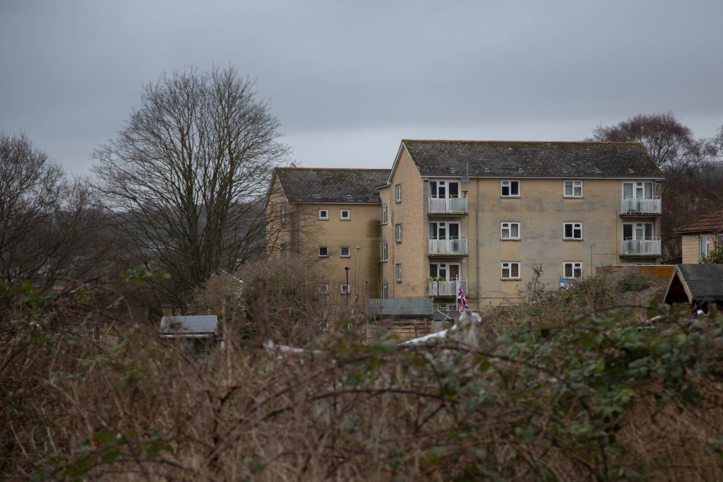
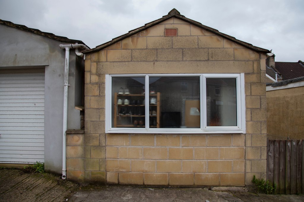
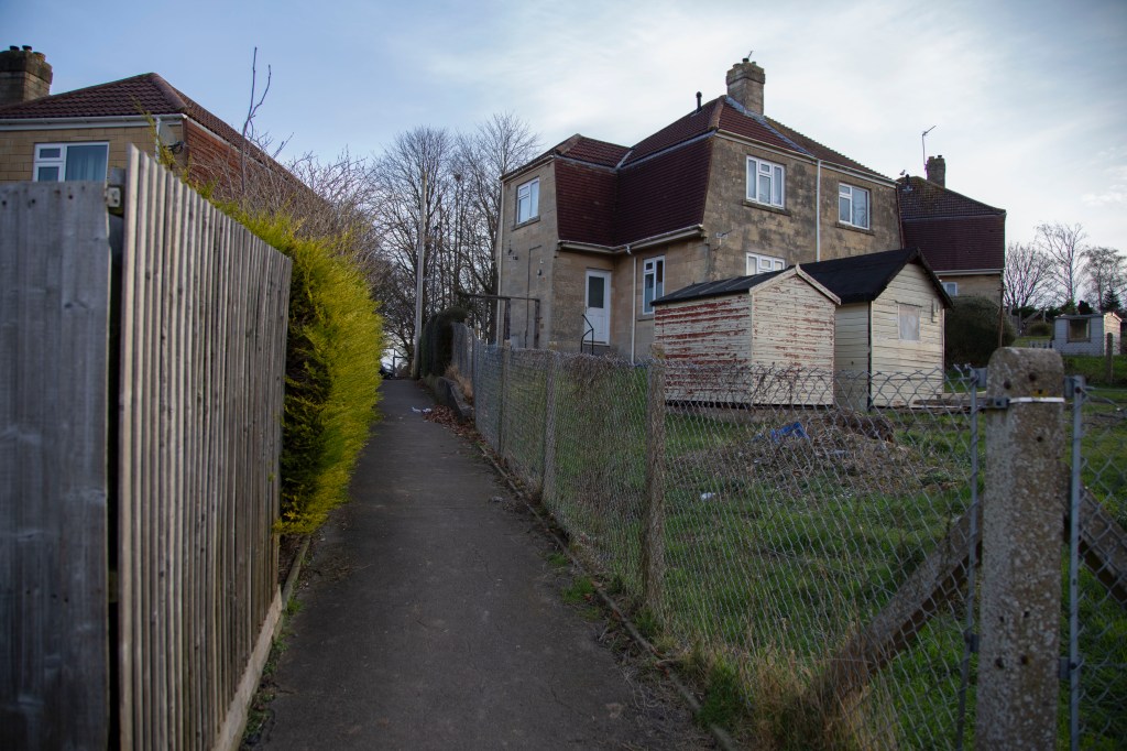
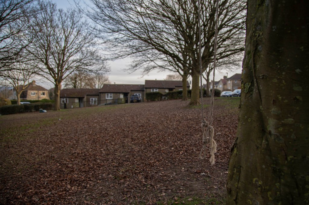
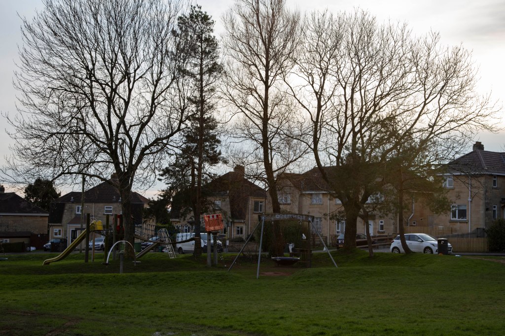
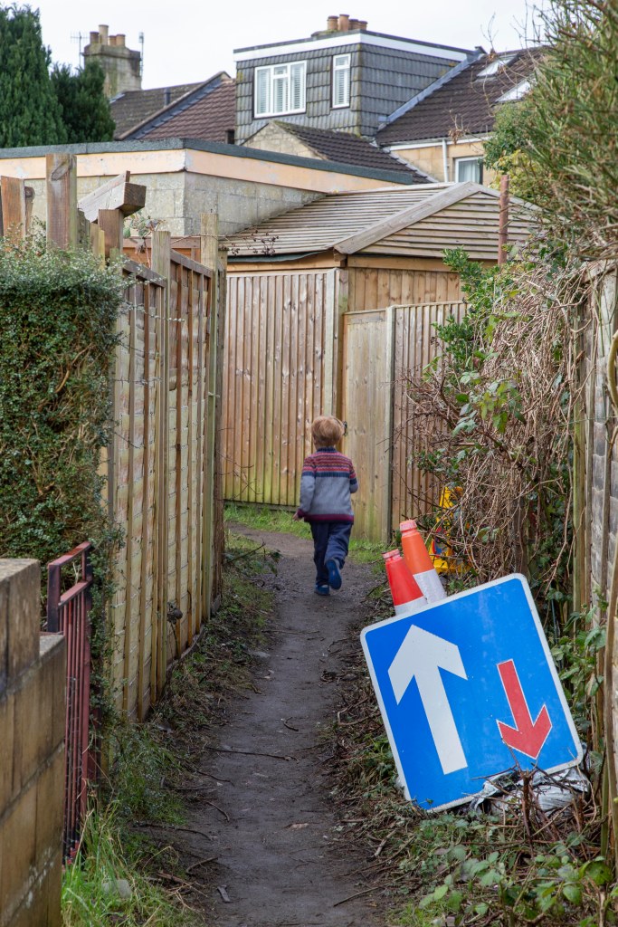
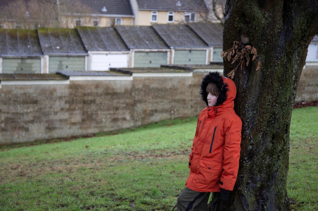
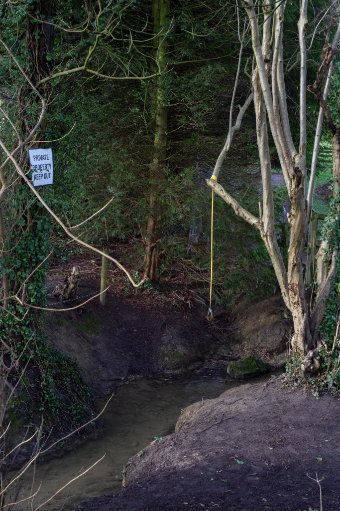
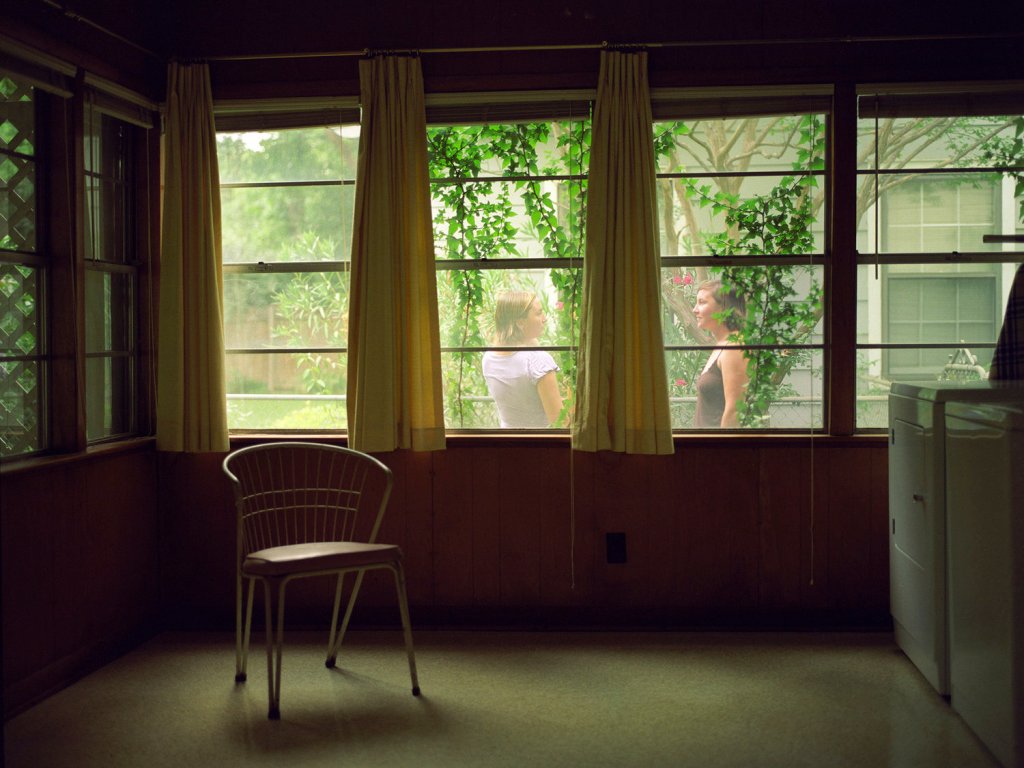
Smithson’s guide looks to educate the up-and-coming architects, through the use of poetic descriptions of Georgian features acting as anchorage to his photographs. The guide concentrates on the central “touristy” parts of Bath. The descriptive narrative used by Smithson appears more akin to the sales pitch of an estate agent than a guide book. This has been something I have been exploring within my own practice, using estate agent tropes to describe dwellings and as a way of challenging the viewers initial appraisal of an image. [figure 3]
After watching Patrick Keiller’s film “London”, I have been keen to look at combining audio with images in the form of ambient sounds and recorded oral interviews with residents. In Keiller’s film his fictional character Robinson is commissioned with the task of discovering, first the ‘problem with London and then later the ‘problem with Britain’. Keiller, using static images (almost like photographs) and narrative, explores the decline in vernacular dwellings:
“Both London and Robinson in Space had set out with a perception of economic failure, the result of a backward, specifically English capitalism; but in the second film, this gave way to an understanding that the UK’s social and physical impoverishment was not a consequence of some inevitable ‘decline’, but of the successful operation of a particular economic system in the interests of those who own it. The ‘problem’ that the film had set out to examine was revealed as the result of political decisions that could be changed.” [Keiller 2014:6]
I find many similarities with Keiller’s film and my own practice, particularly when looking at the decline in dwelling space and disparities in wealth distribution across most cities in the UK. Keiller states:
“The juxtaposition of successful industry and the urban decay in the UK’s landscape is certainly not confined to the north of the country. A town like reading, with some of the fastest growth in the country (Microsoft, US Robotics, Digital, British Gas, Prudential Assurance) offers, albeit to a lesser degree, exactly the same contrasts between corporate wealth and the urban deprivation: the UK does not look anything like as wealthy as it really is. The dilapidated appearance of the visible landscape, especially the urban landscape, masks prosperity.” [Kieller 2014:46]
Keiller further goes on to say:
“Buildings and other infrastructure often seem surprisingly rudimentary or dilapidated to visitors from other industrialised countries, and in London especially, even relatively wealthy people often live in houses that are small, old and architecturally impoverished, but extraordinarily expensive.” [Keiller 2014:70-71]
What is lacking in Keiller’s work is a voice of the people he appears to be championing, this is something I want to explore more in my own practice over the coming months.
My goal for disseminating my practice comes in the form of a photo book in the form of a mock guide book format would lend itself well to my practice, especially used as a tongue-in-cheek alternative look at the topography and social disparity with Bath. The book would include walking routes through cross sections of Bath, descriptive narrative and images, fitting for a tourist guide or estate agent’s brochure. I would look to exhibit printed images, text in conjunction with the book. Potential exhibition spaces would be Museum of Bath Architecture (MoBA) or Royal United Hospital (RUH), each have a very different audience. MoBA has an audience draw from Bath residents, architects and students; whereas the RUH will have a wider audience base all be it predominantly local.
References
Keiller P, 2014
Mansoor J, 2005 “Ed Ruscha: One-Way Street” https://americansuburbx.com/2012/04/ed-ruscha-one-way-street-2005.html [Accessed 28.04.2021]
Smithson P, 1971 “Walks with in the Walls” https://fcbstudios.com/download/n-com-eve-walks-within-the-walls_interactive.pdf [Accessed 26.04.2021]
Images
Figure 1. Ed Ruscha “Every building on the Sunset Strip” 1967 https://americansuburbx.com/2012/04/ed-ruscha-one-way-street-2005.html [Accessed 28.04.2021]
Figure 2. Peter Smithson 1971 “Walks within the Walls” guidebook https://museumofbatharchitecture.org.uk/explore/ [Accessed 28.04.2021]
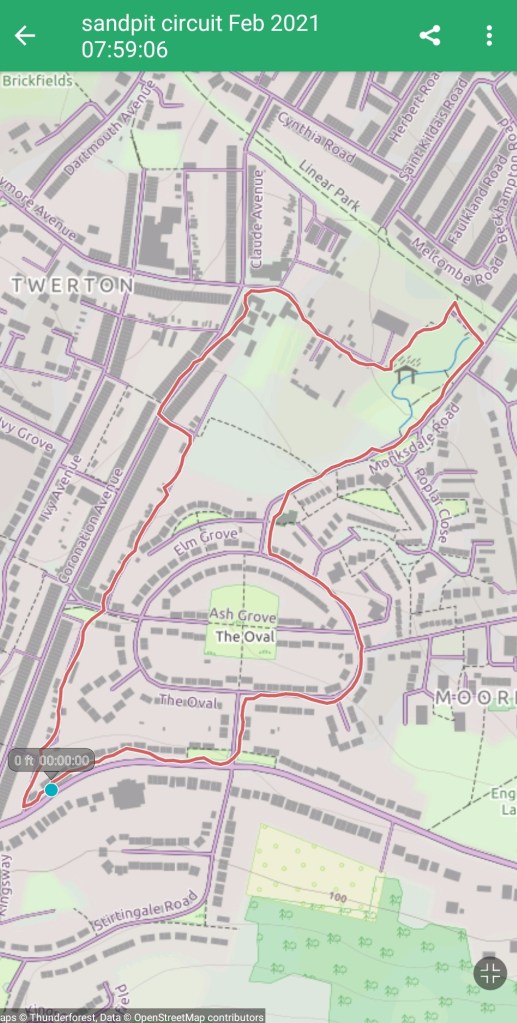
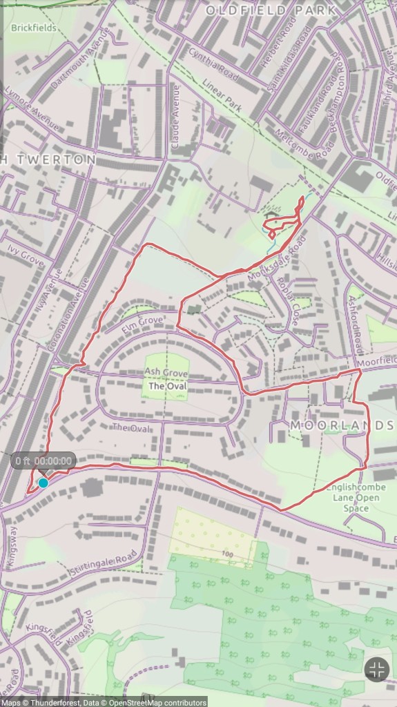
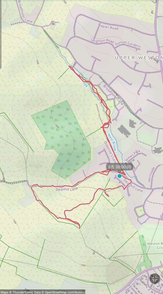
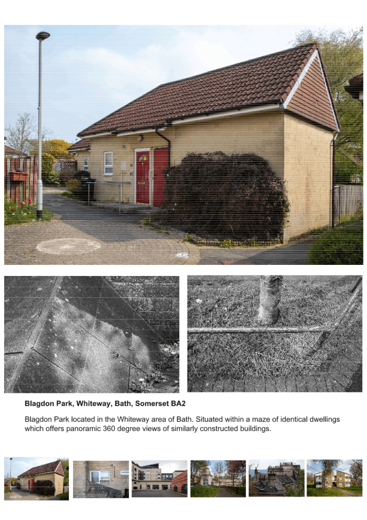
Figure 3. Tim Beale 2021 “Blagdon Park: Walk 1 South West to North East”
Videos
Video 1. Tim Beale 2021 “Walks around Southdown & Twerton” https://youtu.be/XuMm6sh3umc
Video 2. Tim Beale 2021 “South to North” test video https://youtu.be/8p7-0AfqI7M