PHO705: Final Major Project

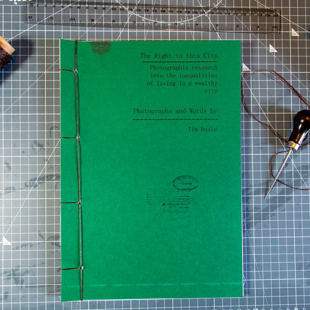
As I’m about to submit my final assignments I feel myself reluctant to do so. I have enjoyed the whole process of returning to studies and embarking on the Masters at Falmouth University, it has been a fantastic experience that has pushed and tested by practice far beyond anything I would have expected. The fact that I have produced a book as the final piece is unexpected as I had always expected to finish on an exhibition. But as I progressed through my research it became more apparent that it deserved a book, after all a book acts as a lasting legacy.

Where do I go next? Well this project is far from over as I feel I’ve only scratched the surface of the issues surrounding housing inequality. I have found that I am far from alone in my thinking and have collected a small group of like minded people to collaborate with as I find the next outlet for this project. One of my ambitions is to find the right exhibition space or platform to create something that challenges viewers to consider how we live today, where most people are spending around 70% (or more) of their income on simply having a roof over their head. I want people to realise that the right for everyone to be ale to have a home in the city they choose to work isn’t one that is unattainable but a very real right.

Responses to the book have been resoundingly positive with excellent reviews from Chris at Big Issue and Dr Amy Frost, Architectural Historian at Bath Preservation Trust. Both of whom helped to give context to my research.

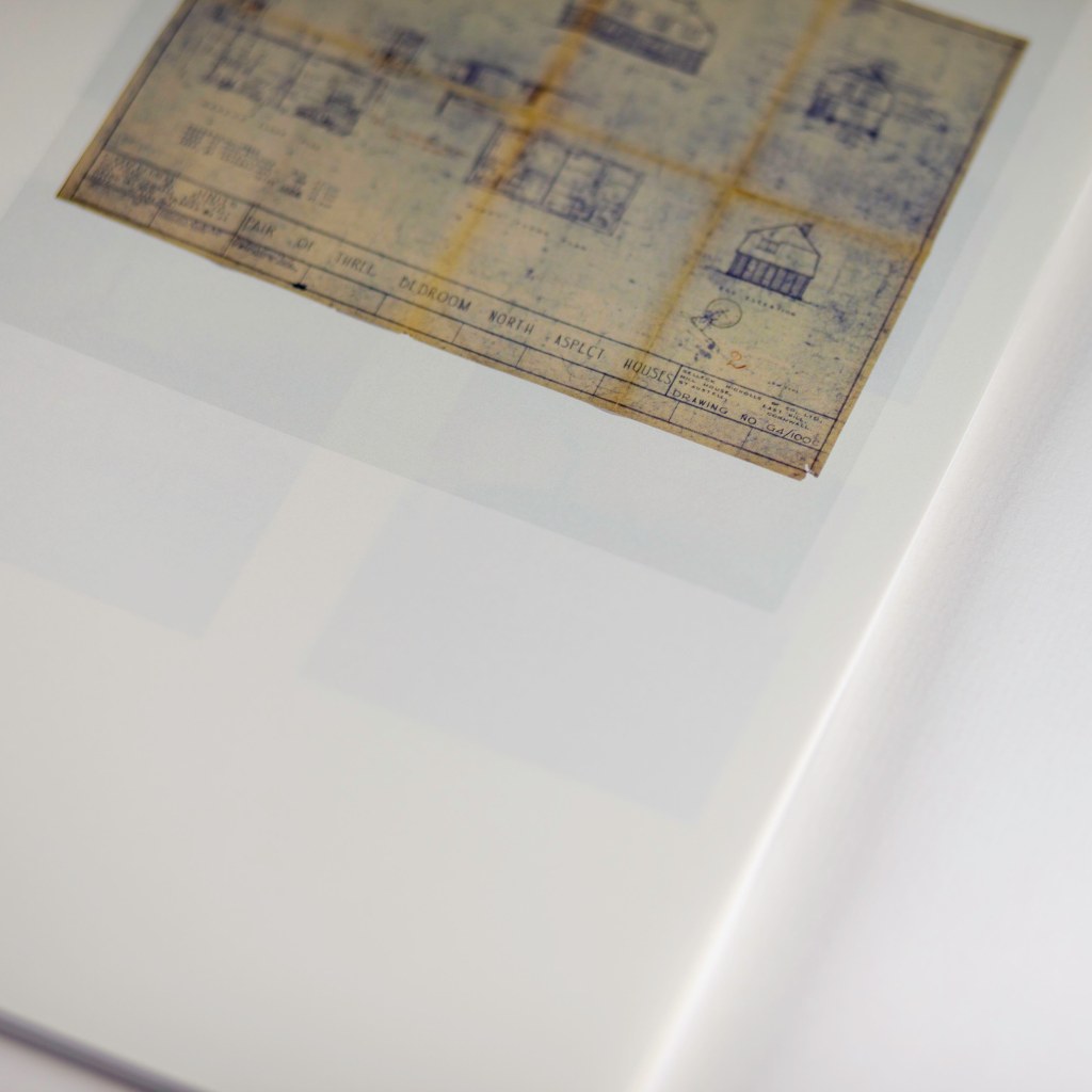
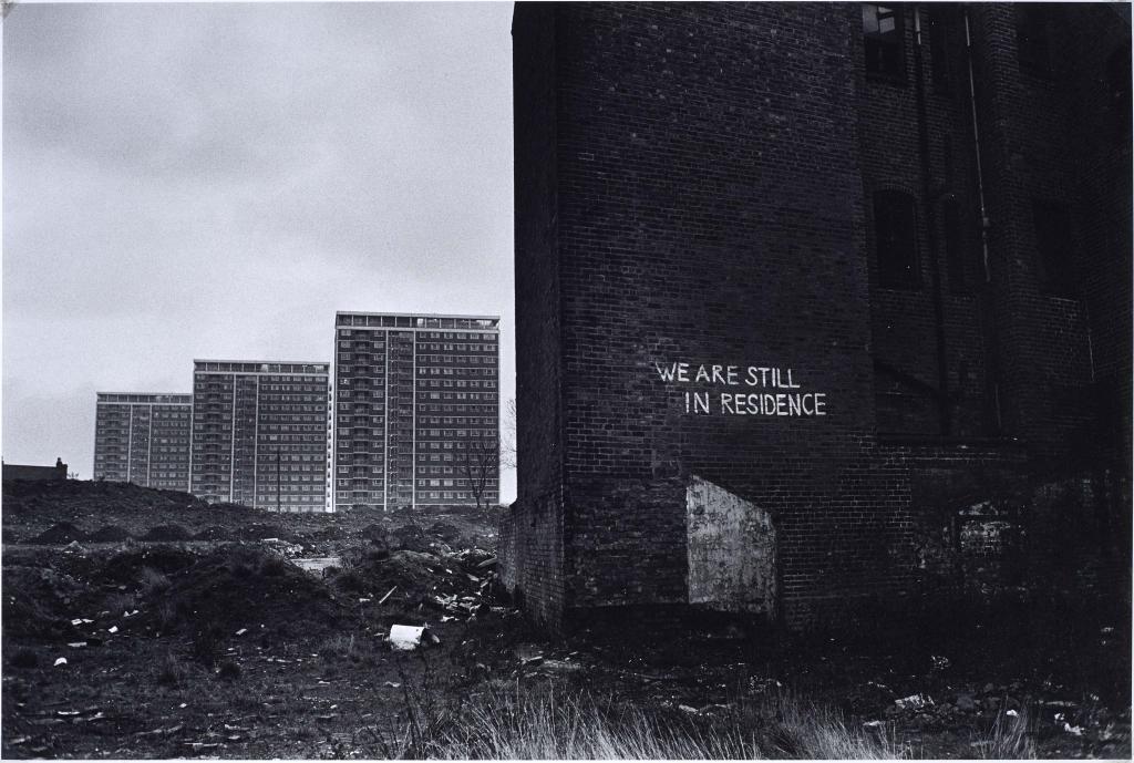
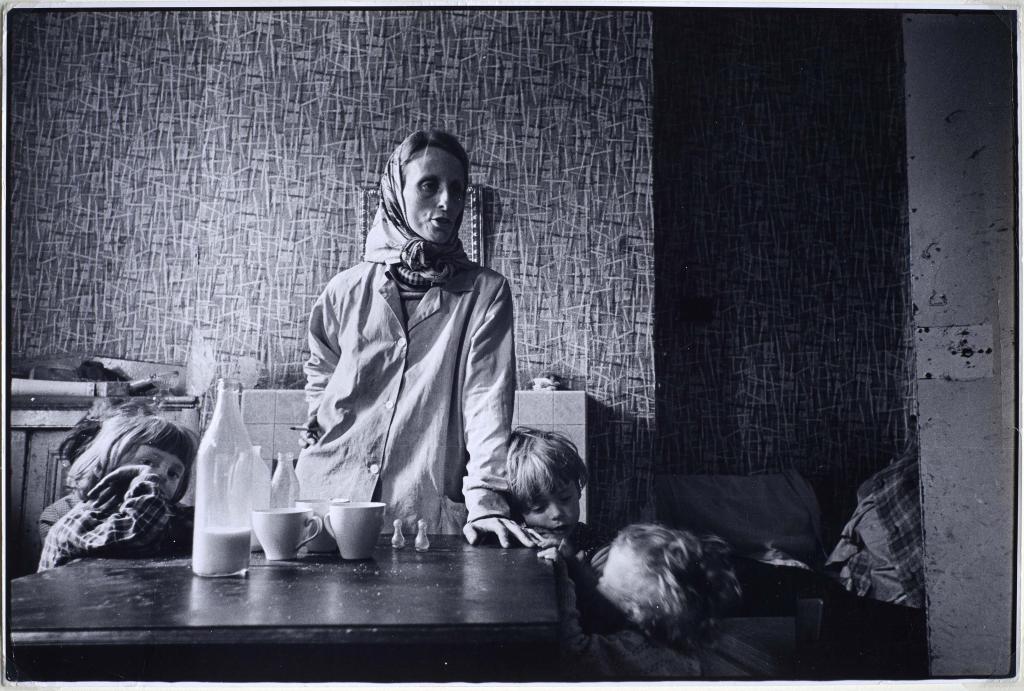
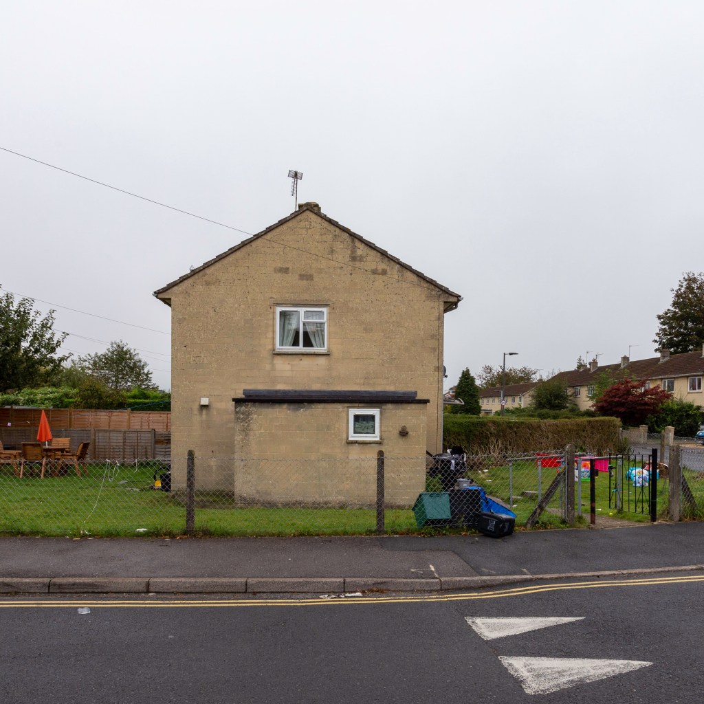
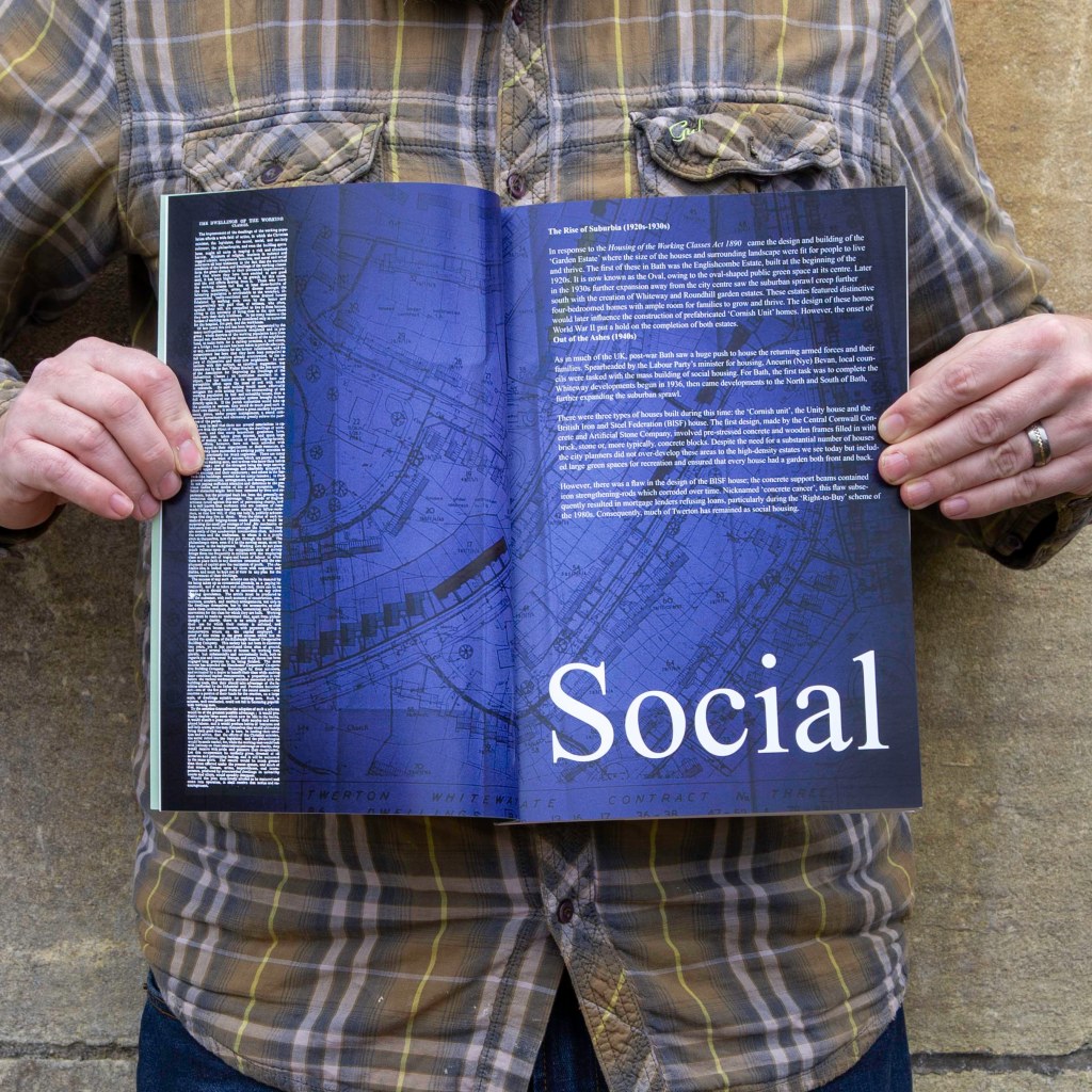
“Bath is a city of great contrast. The story that gets frequently gets told is one of Georgian building splendour and Roman imperial history. The story that has not been told is the story of the industrial working class and the conditions in which they lived and worked.
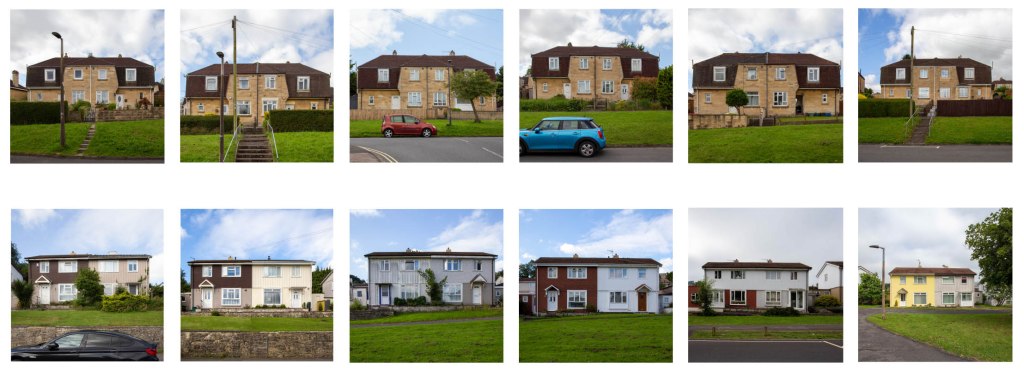
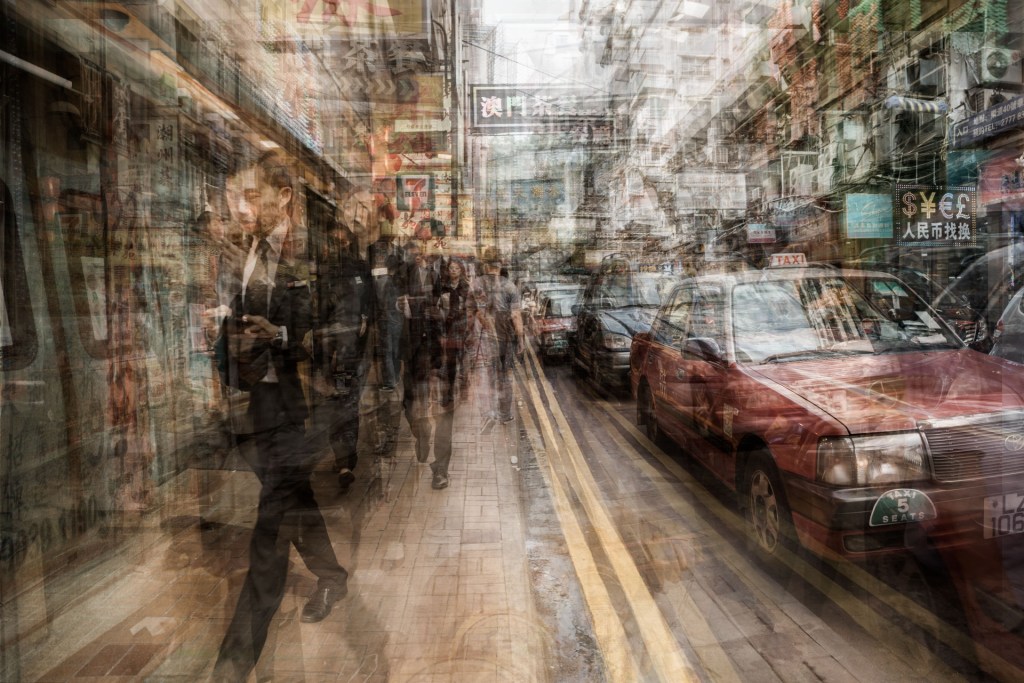
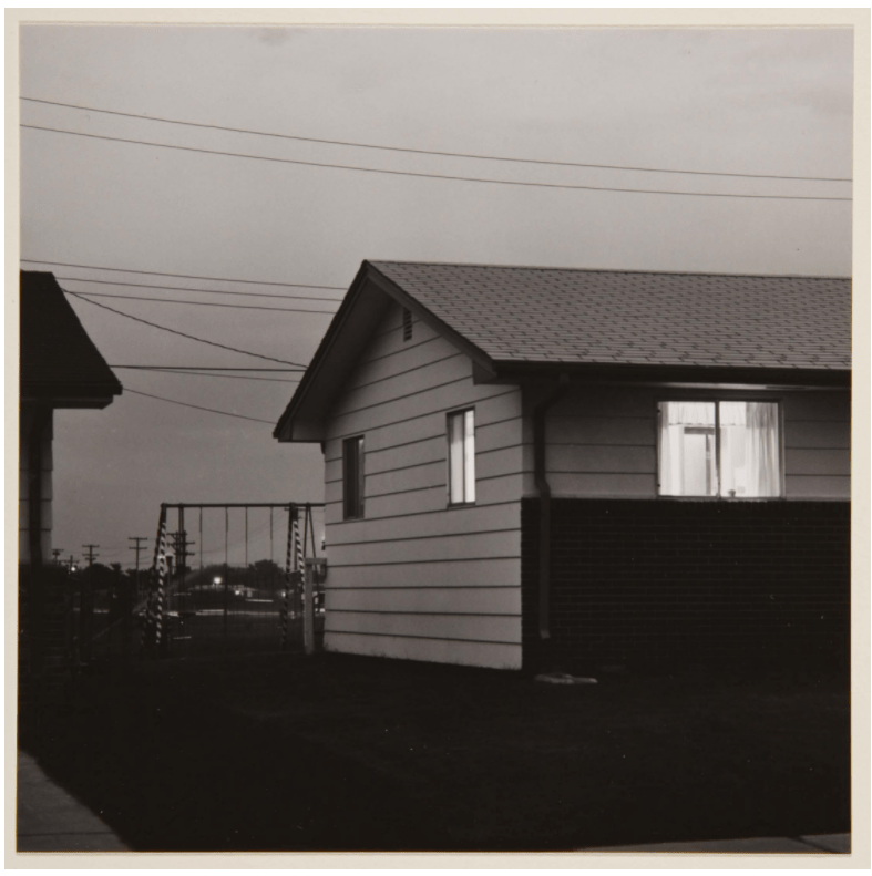
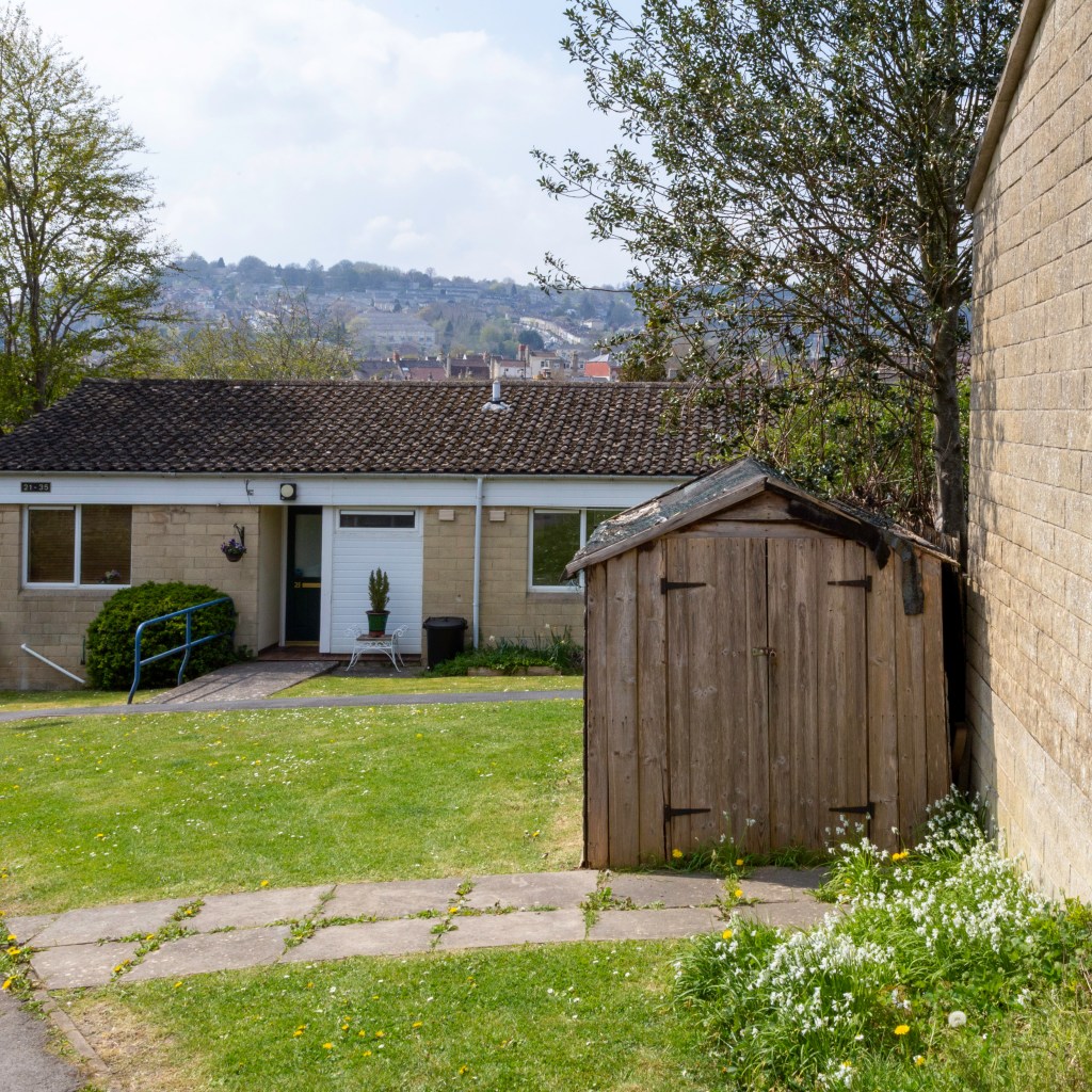
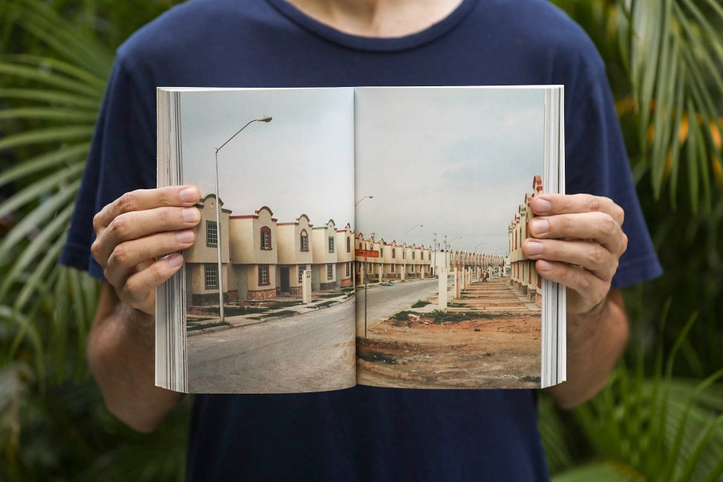
The project by Tim Beale goes some way to readdressing this imbalance. His work using the medium of photography provides an interesting overview of social housing construction and styles in Bath. When you read his work, it brings provides a very different picture of Bath life, no glamour, no high fashion and no historical “white” wash.
A very interesting work which introduces us to real Bath real people and real stories.”

Chris Taylor, Big Issue

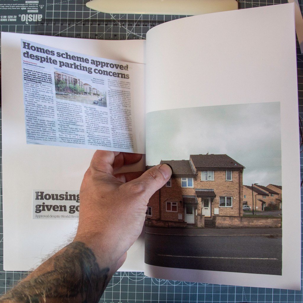
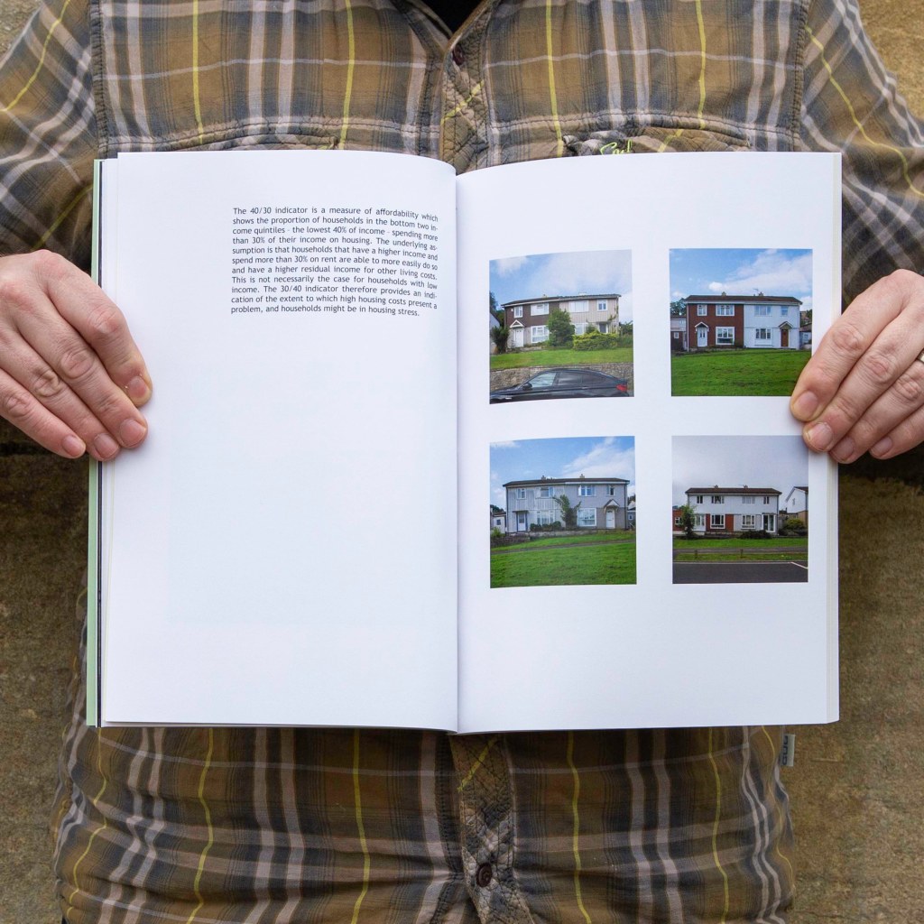
“The Right to This City comes as a timely reminder of how this city once led in the provision of social and affordable housing, but is now compromised by the impact of land value and Bath desirability. It clearly illustrates the route to where we are now in the city, with new designs for housing with little or no affordable provision, and with dimensions that by post-war standards would be seen as uninhabitable.
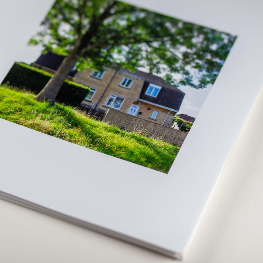
By looking beyond the famous architecture of the 18th century to the streets and neighbourhoods where the residents of Bath actually live, this work encourages us to question whose city is this? The photography in the book also serves to form a significant historic record of buildings that are overlooked and underappreciated in Bath. It captures architecture too frequently dismissed, yet of high value to the community and to the understanding of the development of the World Heritage Site it sits within. This is the period of architecture most at risk in Bath and if we are not careful, the images in this book might one day be the only evidence of it to survive.”

Dr Amy Frost, Bath Preservation Trust

In terms of getting my book out there, I have been interviewed by Bath Newseum, an independent news blog based in Bath. The interview is featured online as both a written piece and video interview, and can be viewed here. This then sparked interest from the Bath Magazine, who will be interviewing me for the January addition, looking at my practice and current projects. Amateur Photographer magazine column writer Benedict Brain has asked to cover the book in his Final Analysis article. Both magazines are scheduled for release early January.

Whilst my desire is to continue exploring where this project will lead I have another personal project in mind and know that what I have gained through the MA will give me the expertise to produce another body of research based work to be proud of. One of the many enjoyable expects to the MA was writing this CRJ (Blog) and I aim to continue to write a regular blog over on my website, so for those who have followed this process and enjoy reading my thoughts head on over there (later in December or early January, as I’ll need a little break). And you can now buy your very own limited edition copy of The Right to This City:

PHO705: Quiet protests

“To value photography as art is not however to denigrate photography in the service of different ends. We owe a debt to the cameramen who worked in Vietnam, for example. Photographs like theirs encourage us to resist what evil it may be in our power to correct.” [Adams 71:1996] 

Do environmental photographers, such as Edward Burtynsky and George Steinmetz produce meaningful images of protest or works of art that offer the viewer a means of escape? When looking at images of fauna in their natural habitats I find myself asking this question. By the simple act of exhibiting images in a gallery we now longer see them as referents for the evils of the world but art, and in doing so they lose their truth value. 

Steinmetz a photographer for the New York Times and National Geographic, who concerns himself with the subjects of remote landscapes, climate change, and humanity’s ever increasing need for food. Steinmetz’s practice is dominated by his aerial photography of grand landscapes, manufactured land, or agriculture in action.  The impact of which one first viewing may appear picturesque, abstract or alien but rarely disturbing. More impactful and immediate are Steimetz’s images we see from inside industrial complexes or farm facilities, workers in action or live stock in distress (figure 2). The presence of humans and their involvement in the distress of other, brings home the reality and truth value of the photograph. Without the accompanying text the aerial landscape do not hold the same weight as those that are more environmentally engaged, the obvious human intervention on the landscape or brutality towards livestock. There are two sides to Steinetz’s work, a disjoint, that of the commercial and the concerned.  

Meanwhile Edward Burtynsky offers us a more abstract of the world around us, as his concern for the world we are leaving behind us is that of a stripped landscape. These images offer us a alternative view of the world, something alien and yet there is something familiar. There is no question here that these are not photographs of protest, they do not shout at the viewer. What they do is offer the view the space to reflect, to stop and think. I his own words Burtynsky reflects on the impact of globalism and the needs of humankind: 

“But all these things have one thing in common, which is that this is the world that is necessary – in the background, humming away – to allow us to live the lives we do. When you buy that new thing, where does it come from? And where does it go when you’ve thrown it away? Because there’s no such place as away” [Burtynsky in Davies 701:2020] 

The work of Burtynsky reminds me of what Robert Adams states, in his essay “Photographing evil”: 

“Art can convincingly speak through form for significance bears upon the problem of nihilism and is socially constructive. Restated, photography as art does address evil, but it does so broadly as it works to convince us of life’s value; the darkness that art combats is the ultimate one, the conclusion that life is without worth and finally better of ended.” [Adams 70:1996] 

What makes for a greater impact when gazing on environmental photographs, landscapes, is when there is human presence. This give a scale to the thing; we can see and compare our reality against what we are being shown. Within my own practice the familiar landscape of vernacular buildings are used as metaphor for socioeconomic discord. I do not show off Bath’s grand Georgian architecture but the homes of the people who service the city and the millions who visit. When viewed I know that this is not art but documentary, it is a quiet kind of protest. 

Figure 6 “Not our Prime Minister” 2021 Tim Beale

References 

Adams, R “Beauty in photography” 1996 Aperture 

Davies, L “Edward Burtynsky” The journal of The Royal Photographic Society Nov/Dec 2020 Vol 160/No.9 

Images 

Figure 1 Steinmetz, G  “The terraced Yuanyang rice fields in Yunnan province, China” https://www.canon-europe.com/pro/stories/george-steinmetz-storytelling-aerial-photography/ 

 Figure 2 Steinmetz, G “Feed the planet” https://georgesteinmetz.photoshelter.com/gallery/Feed-the-Planet/G0000lrER6EZBBQA/ 

Figure 3 Burtynsky, E  “Uralkali Potash Mine #4, Russia” 2017 https://www.format.com/magazine/features/photography/edward-burtynsky-photography-anthropocene-project 

Figure 4 Burtynsky, E “Phosphorus Tailings Pond, Florida” https://www.theguardian.com/artanddesign/2016/sep/15/edward-burtynsky-photography-interview 

Figure 5 Burtynsky, E “Saw Mills #1, Lagos” https://www.newyorker.com/magazine/2016/12/19/edward-burtynskys-epic-landscapes 

Figure 6 Beale, T “Not our Prime Minister” from The Right to this City series, 2021

PHO705: The Right to This City – Engaging the viewer 

One of the challenges I feel with presenting my practice to a wider audience is ensuring people will want to look and explore the work. The topic of housing inequality and the struggling working class may seem bleak and unappealing to many and will be its own barrier.  

As a father I take immense pleasure in reading to my children and seeing what they engage with, what types of books, images and media draw their attention. Pop up books and informative books with lift up flaps have the upper hand when it comes to holding their attention and invite them in to explore the story being told. Taking this as a starting point I looked at how to achieve this with an older audience, whilst creating a visually impactful body of work.  

Figure 1 Timeline from ‘The Right to This City’ Tim Beale 2021

The use of different textures, bold fonts, fold outs and paper weight offer a visual and tactile object that invites the viewer to take their time to explore the book. I deliberately wanted to step away from the standard photobook with its crisp white paper, one image per page with minimal or no text. The main body of information at the beginning of the book is overlayed on top of stylised building plans, the use of strong dark colours contrasts with the white text. The fold out timeline enables the reader to reference the housing policy changes and subsequent changes to the built environs. A second fold out at the back of the book features social media posts depicting the ongoing conversations surrounding the housing crisis. 

Three paper stocks are used to differentiate between archival objects, newspapers articles and photographs. The use of thin paper stock for the archival objects, mirrors their fragile nature, as the images on the following page start to emerge through the paper. Textured paper is used for newspaper articles to offer a tactile experience, whilst silk 180gsm white paper is used for photographs to offer an honest representation of the subject.  

The binding and final finishing of the book is made to resemble the city council contracts that have been issued over the 100-year period my researched covered. This further anchor each photograph to the research within the book. The projected cost of the book, at £45 per book, will limit the audience reach in this format, appealing to a more middleclass audience. A limited print run of 20 copies, the book will appeal to the collector. The next step for this project will be the production of a low-cost zine, aimed at a wider audience. The zine will also give me the opportunity to collaborate with other artists, writers, and photographers.  

Images

Figures 1 & 2 from “The Right to This City” self published by Tim Beale 2021

PHO705: Typologies in Topography  

Three by five, three by four, three by two, five by six, these are but a few of the grid like combinations of images presented in the body of work called “Typologies” by Bernd & Hilla Beche that spans some four decades. Documenting the structures that sit within an industrial landscape like monolithic sculptures, the Becher’s ability to remove the often overlooked from its setting and place it down onto paper is in itself a work of art.   

“The Becher’s technical rigor is also exemplary, the strength of their work owing to their consistency of framing and evenness of the light on their subjects. The simplicity of their practical approach-and that of the other photographers from the ’New topographies’ exhibition-has endured within landscape practice as well as within other spheres of contemporary photography.”[Alexander 128:2015] 

The concept of typologies within the medium of photography is not a new one, but is one that has been used to great effect especially when looking at the work of the likes of  Ed Ruscha. Ruscha uses the everyday, mundane and bland within bodies of work such as ‘Every building on the sunset strip’ as a method to create flow and a sense of movement as the viewer is transported along the strip, move from image to image as one would drive from building to building. However the way in which the Becher’s deliver their images is much more static, rigidly controlled, placed into grids, edited to emphasis the familiar, whilst allowing the viewer to consider the contrasts between each structure. 

Figure 2 “Every building on the Sunset Strip” 1965 Ed Ruscha

“After all, Bernd and Hilla Becher are not interested in the individual photo, but above all in what their way of seeing, restrictively defined in its way, actually makes possible, namely a comparison of appliance-like structures of a particular type, such as gasometer , halls and silos.” [Zweite in Becher 15:2014] 

It is not only the finished image that is controlled so to are the subjects, not so much the staging or composing of each structure but rather the construction. Each photograph is meticulously planned, the time of day, weather conditions, elevation of camera, and position of structure within the frame.  

“We precisely did not show pictures that we had composed but instead images that were already composed. We simply selected objects that could be captured and were thus there for the taking.” [Becher 7:2014] 

Discussing the “New Topographic: Photographs of a Man-Altered Landscape” (1975) exhibition, which featured Bernd and Hilla Becher’s ‘Topologies’, Jesse Alexander states: 

“Just as the subject matter in the photographs was commonly considered mundane or bland, the visual qualities of the photographs were simple and unembellished and were met by traditionalists with skepticism and perplexity.” [Alexander 127:2015] 

Figure 3 “The right to this city” 2021 Tim Beale

Within my own practice the use of typologies has been a useful tool to illustrate the uniformity of publicly funded social housing of the 1930s and 40s. To ensure each image created, for the topology series, had a uniform appearance I had to set several control factors. Each image needed to be taken during the same weather conditions, framed within the same space, and using the same camera setting such as f stop and aperture. This was particularly challenging give Bath’s topography, being built in a valley, many of its houses are built running along steep hills. Shooting straight on with a wide-angle lens gave me the best option to create uniformity with each photograph. The use of repeated images of mundane dwellings worked well for the series of early social housing but less so for more contemporary housing stock. As such, I chose to only adopt this method for a few typologies through the book “The right to this city”.  

References 

Alexander, Jesse “Perspectives on place: Theory and practice in landscape photography” 2015 Bloomsbury 

Becher, Bernd & Hilla “Typologies” introduction by Armin Zweite 2014 edition MIT Press 

https://www.photopedagogy.com/typologies.html [Accessed 30.10.2021] 

Images

Figure 1 Becher, Bernd & Hilla “Typologies”

Figure 2 Ruscha, Ed “Every building on the Sunset Strip” 1965

Figure 3 Beale, Tim “The right to this city” 2021

PHO705: Photographs of an unequal Britain  

Photography in Britain in period between the late 60s to late 80s was one of protest and drive for change in a dystopian landscape created by endemic poverty and increasing inequalities in housing. Political upheaval during this time resulted in increased unemployment as a result of the privatising of publicly owned businesses and closing down of factories and coal mines. Charities such as Shelter and the Child Poverty Action Group worked tirelessly to raise awareness and funds to help those who were homeless, unemployed or living in substandard conditions. The director of the Child Poverty Action Group, wrote: 

“If civilised life is to continue, the rich must strike a new social contract with the poor to the extent of breaking the cycle of inequality.” [Field in Stacey 68:2020] 

Exit Photography Group (Exit) 

From 1974 the group was made up of the self-taught photographers, Paul Trevor, Nicholas Battye, and Chris Steele-Perkins. At that time Battye worked as a security guard at the Calouste Gulbenkian Foundation, the foundation funded the first half of the groups six-year survey of Britains inner cities,’Survival Programmes: In Britain’s inner cities’ [1982]. Exit had a keen desire to use photography to make a difference, key to this was their continual presence in amongst the communities they engaged with. The group would often revisit inner cities location with their prints to share with the people living their. As Trevor recalls: 

“People asked us for prints, and we gave them our reject prints and then we couldn’t give enough prints away, so we agreed to do an exhibition. There was an annual festival, E1 Festival, and we made the prints. I had to sneak into Regent Street Polytechnic, as it then was, because we didn’t have a dark room.” [Trevor in Stacey 71:2020] 

Exit were ever conscious of the politic of representation and often praised for their commitment to the groups ability to honestly represent the people in their photography, by having a policy of naming those in the photographs but of not crediting the individual photography generated praise from within the photographic community. The ‘Down Wapping’ project highlighted the way in which private and commercial development in the area damaged the community and further exacerbated unemployment. The project draw the attention of national press such as the Sunday Times and British Journal of Photography, this attention elevated the group’s presence which in turn enabled them to continue to produce projects of protest against Britain’s inequalities. The group worked closely with the East End Docklands Action Group to highlight the perceived destruction of a local community.  

 “To put this into context, redevelopment of London docklands generated fierce political debate between the Conservatives, who favoured private funding to develop the area for commercial purposes and provide private housing, and the Labour Party, which wanted state funding used to create public housing and employment opportunities for the existing community.” [Stacey 71:2020] 

Nick Hedges 

The work of Nick Hedges images from Birmingham in the early 70’s holds a special connection for me, as my early childhood memories are of my time living in Birmingham. I recall whole streets of boarded up terraced housing, awaiting demolition, how a handful of friends lived in the one or two remaining households in those streets. I also recall playing in abandoned houses, finding evidence of drug use, plastic bags of glue, used needles and empty pill bottles. These things were just part of life and we just didn’t question it. One of my earliest memories was visiting the factory where my dad worked, not unlike the factories featured in Hedges’ photographs, however, not long after that visit my dad, along with many others, was laid off as the factory fell victim to the politically driven economic turmoil the country faced.  

Talking at the Bristol BOP21 festival Hedges described how photography in the past (1960-1990’s for example) held much more power than today as we now view images with much more suspicion. As such the photobooks and pamphlets from those times can act as a way to revisit and reflect upon the past, helping to inform the present, as I find myself doing now.  

Growing up seeing the growing inequalities in Britain has informed my practice, as for these earlier photographers, I want to use photography to raise these issues, to bring to the fore the struggle not only faced by the poor but also by the working class. The evidence of this inequality can be seen in the very fabric of the city, the suburb, and town. Government policies have altered the environment we live and work in, the size and density of living space, the infrastructure, and the use of a city. Government has monetised, privatised and perverted our right to live and thrive in the places we want to live in. Much of what the likes of Exit and Nick Hedges, and many other photographers, have done to highlight these issues has created a narrative of social dystopia that has built and led to the current crisis we face in the form of housing and Brexit.  

References  

Stacey, Noni “Photography of Protest and Community: The radical collectives of the 1970s” 2020 Lund Humphries 

https://photoworks.org.uk/exit-photography-group/ [Accessed 30.10.2021]  

https://www.museoreinasofia.es/en/collection/artwork/mother-and-her-family-winson-green-birmingham [Accessed 30.10.2021] 

http://www.nickhedgesphotography.co.uk/ [Accessed 30.10.2021] 

Nick Hedges in conversation with Martin Parr, “BOP21 Festival” RPS House, 23.10.2021  

Images 

Figure 1 – Exit Photography Group images from “Down in Wapping” 1975 “Survival Programme: In Britain’s inner cities” Nick Battye, Chris Steele-Perkins, Paul Trevor 1974-82

Figure 2 Nick Hedges images from Birmingham between 1968 and 1972

PHO705: Photography and the city 

Fig 1 “Untitled” Tim Beale 2021

The very nature of photography lends itself to the documentation of the city, its structure, people and essence. Whether it comes from psychogeography or documentary the form of capturing a two dimensional representation of the space around us is one that is familiar, from the Parisian scenes of Eugene Atget to the bustling streets of Riccardo Magherini’s Hong Kong. The photograph provides a document of social, cultural and political concepts of the city. 

“Photographs display attitudes, agency and vision in the way a city is documented and imagined.” [Tormey xiv: 2013] 

The city is a social space, dominated by city structures that effect they way people live, interact and form social communities. Within my own practice I concentrate on the evolution of the city and how social and political changes influence the evolution of the manufactured space. Highlighting Urban and Suburban issues to engage and encourage cultural, social and political discussion. Framing and rendering the three dimensional city, in a two dimensional representation that conveys its culture, society, emotion and aesthetics.  

“Photographs can celebrate or critique presiding ideology and privilege. More specifically focused views can adopt metaphoric frames that serve to emphasise particular aspects of experience: the ‘institutional city’ and the place of power; the ‘everyday city’ of the street; the city of social practice or the site of diaspora’; the ‘hybrid or global city’; the ‘engendered city’; the ‘network’ or psysogeographic. Just as the city can be theorised in different ways, so it can be presented photographically in different ways: geographically – describing the evidence of its economies in the buildings and infrastructure; anthropologically in describing evidence of its culture; sociologically in describing examples of interaction.” [Tormey 26:2013] 

I am trying to convey an unexaggerated portrayal of the everyday city and its suburbs, the dwelling places of the everyday worker. The structures that create a city are also the structures that shape and define the people who live in them. As such, my practice concentrates on the simplest of dwellings, the mundane or overlooked. These spaces are no less important than the grand stately homes, treasured by the nation, in fact they are of greater importance as they are a fixed point of reference when we map social and political history.  When we look at these dwellings we start to see, not only, the decay but also the pride and sense of community. There is something about a common struggle that brings people together, reading the details in a home can tell this story. As with Robert Adams photographs that featured in the exhibition “New Topographic: Photographs of a Man-Altered Landscape” there is a simplest style and beauty to be read in these images.  

Fig 4 “Denver, Colorado” Robert Adams 1970

When we look at his photograph “Denver, Colorado” we see a dwelling, in the early evening as the sky is not fully dark, we can see there is a light on so can assume the home is occupied. We are also given a clue that there are children given the presence of the swing set. We only see a section of the dwelling but it is clear this is a single storey building, no fence delineates a front or back garden, in fact there appear to be no boundaries between properties. We can then imagine that this is not the home of wealthy occupants.  

As photographers we strive to tell stories in our two-dimensional images, we create seeds that we then plant into the minds of the viewer. Reducing a city down to a flat image of dwellings, challenges the viewer to create a mind map of the city, to follow the trail, join the dots and engage with the space presented by the photographer. This is what I aim to achieve in photographing the city.  

References 

Tormey, Jane “Cities and photography” Abingdon : Routledge 2013 

Images 

Figure 1 “Untitled” Tim Beale 2021

Figure 2 Eugene Atget https://www.moma.org/artists/229 

Figure 3 Riccardo Magherini “HK” http://www.riccardomagherini.com/fineart/portfolio/hk-series/ 

Figure 4 Robert Adams “New Topographics: Photographs of a Man-Altered Landscape”  (1975) https://www.pierremm.com/architecture-photographer/architecture-photography-famous-artists.php 

PHO705: Homeownership

Fig 1 Tim Beale ‘Untitled’ 2021

Lately I have been going down the rabbit hole of fonts and book layouts creating the bones of my book. However, a productive one to one with my project supervisor offered a chance to come up for air and to do a little research into what other photographers are doing and how.  

Revisiting the work of Alejandro Cartagena’s and in particular the book ‘A small guide to homeownership’ is a useful view of how a book can be constructed with a less formal way. Cartagena has crammed thirteen years of work into this book, including fragmented cities, which for me was, in part, inspiration for this project. The use of contemporary images set against kitsch vintage imagery, alongside the books text, offer the viewer immediate linkage to the idea of home and domesticity. The use of colour and black and white photography is used to identify the difference between historical, research images and Cartagena’s own photographs. This method only become apparent when properly viewing the book.  

Within my own practice I draw upon many forms of research; historical documents, such as plans, tenders and contracts, research papers, books, and social media posts. Each have their own identity and as such I want to be able to show this in my work, this could simply be the use of the same font or layout to matching paper stock. Likewise, the positioning of text with photographs plays a key role, does the text sit above or below the image? Is this format too stale? The text I plan to use for this body of work is taken from the government English Housing reports, which links past housing policies with hard facts about our current housing conditions.  

Looking at a few of the books produced by Hoxton press from photographers such as Chris Dorley Brown’s ‘Corners’ and Sophie Harris-Taylor’s ‘Sister’ in which each book adopts a similar format of placing the text on the facing page. This very simplistic style looks clean and contemporary as apposed to the ‘text book’ style of picture with text below, which would work well with the majority of the formal image text.

References  

Fig 1 Tim Beale 2021 ‘Untitled’ from The right to this city

Fig 2 Alejandro Cartagena ‘ A small guide to homeownership’ 2020 https://tienda.alejandrocartagena.com/product/a-small-guide-to-homeownership/ [Accessed 10.10.2021]

Fig 3 Tim Beale 2021: Mock up for handbound book and research on books

Fig 4 Chris Dorley-Brown ‘The Corners’ 2018https://www.hoxtonminipress.com/collections/books/products/the-corners [Accessed 10.10.2021]

Fig 5 Sophie Harris-Taylor ‘Sisters’ by 2017 https://www.hoxtonminipress.com/collections/books/products/sisters [Accessed 10.10.2021]

PHO705: Photobooks

The process of thinking and planning a photobook has been daunting, from the editing of photos to types of paper. There is a real risk of losing site of what the photobook is for. What purpose does it serve? As Bruce Ceschel states in his manifesto “ Self publish be happy”: 

“ Think about the visceral pleasure of making a book, rather than being preoccupied with publishing something that will make money. Nor should you think about making something that will be selected for the next best-of list, propelling you into stardom. Making a book should be both challenging and fun. It should be an adventure that will make you aware of your own practice, ideas, knowledge, and skills. An adventure that might lead to creating something great – or not, which is alos OK, so long as the journey was worthwhile.” [Caschel 2015:486] 

Taking these wise words into consideration I have begun my journey into self-publishing. I have started by looking at photobooks that appeal to me from an aesthetic point and those that peak my interest in their subject matter. A photobook needs to make me what to pick it up, turn the pages, read the text, as such the choices in paper, cover material, font and layout are crucial. I have often found myself “switching off” when flicking through a photobook that is nothing more than a collection of images on crisp white paper, with no discernable reason for them to be in a book but better suited in a white cube type gallery. 

Jack Latham’s book “The sugar paper theories” is an outstanding book, one that I first discovered whilst visiting an exhibition at RPS house of the same name. Sugar Paper Theories tells the story of one of Iceland’s most notorious injustices. The exhibition itself represented a selection of images and texts from the book and served well to give a glimpse of what the book had to offer. The exhibition introduced the concepts of the book well and certainly encouraged the viewer to want more and take the time to look at the book.  

Latham uses a wide range of paper stock throughout the book, sugar paper for printed texts of police reports and statements, metallic monoprinted pages printed with blown up sections of photographs, light weight single leaf paper with excerpts from interviews, whilst Latham’s photographs are well placed on a more traditional photobook paper. The reader is given the chance to follow the story as it unfolds by unfolding the pages of the book. This is an inspirational body of work presented exactly how it should be.  

Another book that has stood out for me is “Slant” by Aaron Schuman, which pairs images with police reports from the Amhurst Bulletin between 2014 and 2018. At a glance this book looks much like many photobooks with a series of monochrome images set on crips white pages but what sets it apart is the inclusion of the police bulletins. Each image sits opposite a series of bulletins that act as anchors to the images suggested metaphor. The photographs themselves are of simple mundane subjects, a ladder against a tree, a sign, or car, but what Schuman does is allude to something else, thus inviting the viewer to think or react in a different way to these everyday objects. Again, we see the use of different paper textures to define a page with text and a page with a photograph. The bulletins sit on a textured off-white paper and the photographs on a crips white paper. This change in texture and colour adds to the experience of looking through this book.  

Within my own practice I look to ways to engage the reader/viewer, using textures and colours to create something that begs to be explored. The topic of housing inequality is one that can be very dry and unappealing and as such is challenging. By adopting the methods of the likes of Latham and Schuman I can create something visually appealing and intriguing, something that pulls the viewer in and demands to be seen.  

References  

Caschel, B “Self publish be happy: a photobook manual and manifesto” 2015 Aperture  

Latham, J “Sugar Paper Theories” 2016 Here Press 

Schuman, A “Slant” 2019 Mack Books 

PHO705:Subtopia/Exurbia and Urbantopia

As I walk the streets of Bath, I find myself asking; what is the future of suburbia? Where I’m standing can it be described as the suburbs?  

“The nearer we get to the present day, the harder it is to define suburbs precisely. The increasing mobility after the Second World War and the collapse of distinctions between classes, jobs and styles of life make it increasingly hard to generalise accurately about suburbs. So we are left with vaguer concepts such as suburbia, subtopia and now also exurbia.” [HELM 6:2007] 

Often when we think of the suburban environment, we bring to mind the images of America and those by photographers such as Gregory Crewdson, Todd Hido and, Bill Owens to name but a few who have chosen this environment as their subject. But what of the British suburb? Who do we have representing our suburb? Certainly, the likes of Martin Parr, Chris Killip, and Richard Billingham, have been creating images of the people of the suburbs with little consideration for the architecture that creates the environment that influences the lives of these people. We can now look to artists such as Andy Feltham with his “Incidental View” series and Daniel Stier’s “London Fringes” & “Frontier House” capture the environmental make-up of the country. 

Andy Feltham’s statement for “Incidental view” speaks of the mundane and the ability to isolate and identify the small wonders we often take for granted or simply do not take notice: 

“This series of images was born from my desire to re-examine the common place; to confront and question the monotonous. Each piece aims to celebrate the incongruous marriage of perceived isolation with an overriding sense of wonder.” [Feltham online]  

And with both his series London Fringes and Frontier House, Stier is similarly interested in the banal, the unseen and overlooked. The new estates growing beyond the suburb and into “Subtopia” or “Exurbia”. The show houses and soon to be show houses in “Frontier House” typify those of the Exurbanites, the middleclass and commuters.  

Subtopia 

The British suburban can be looked at in two defined terms the Subtopia and the Exurbia. As towns and cities extend past the boundaries of pre-war suburbia, we start to see a class divide of those who have a little and those who have more. The term “Subtopia” was coined in the 1955 by the architectural journalist Ian Nairn, in response to a road trip from the south of Britain to the north. Nairn was reacting to the newly developed estates and how he felt the generic architectural blandness had produced “off the peg” developments, thus removing any sense of identity the town or city once had. Nairn goes on to set out in his manifesto: 

“Places are different: Subtopia is the annihilation of the difference by attempting to make one type of scenery standard for town, suburb, countryside and wild. So what has to be done is to intensify the difference between places. This is the basic principle of visual planning – sociology, traffic circulation, industry, housing hygiene – are means. They all attempt to make life more rewarding, more healthy, less pointlessly arduous.” [Nairn 1955:Architecture review] 

Exurbia 

The migration of high earning workers from large cities such as London, has seen the growth of Exurban estates of larger houses, semi-dethatched or dethatched properties with ample parking (drive and garage) and good-sized front and rear gardens. A far cry from the new “affordable” estates and housing association-built dwellings that have reduced in size over the years. Exurbia is home to the commuters, bank managers, politicians, surgeons and company directors. Nestled into the British countryside the exurbanites can spend weekends walking the dogs emulating the country gent or landowner.  

Exurbia – another phrase created in 1955 but this time by the author Augusta Comte Spectorsky in the seminal book “The Exurbanites”, which acts as a social documentary of post-war US and the middleclass populating the environs beyond suburbia.  

Urbantopia

I find these two terms fascinating especially when applying them to the context of the images I make of the outskirts of Bath. There are clear distinctions between Subtopia and the Exurbs. The 1970’s estates in Twerton in the South, with as many small dwellings crammed in like a maze, compared to the spacious homes created at the same time to the North in Weston. I feel however that I’m drawn more towards subtopia, perhaps because I feel a kinship with the people who live on the fringes, I am kind of an outsider too. There is a familiarity to the space that reminds me of where I can from and who I am. Exurbia is an alien place to me and as such I feel out of kilter making images of such places. However, there is a space that occupies the space between the urban and suburban; I call it Urbatopia, the developed spaces of the 60s & 70s, blocks of flats, maisonettes, and sheltered homes. Maybe it’ll catch on.. 

References: 

https://danielstier.com/London-fringes-1

Nairn, I ‘Outrage’  The Architectural Review 1 June 1955 

Unnamed author “The Heritage of Historic Suburbs”, HELM – English Heritage  

Images 

Figure 1 – Bill Owens  “Suburbia” 1972

https://www.picassomio.com/bill-owens/18674.html [Accessed 11/08/2021] 

https://americansuburbx.com/2010/01/theory-bill-owens-suburbia-2000.html [Accessed 11/08/2021] 

Figure 2 – Andy Feltham  “Incidental Views”

https://andyfelthamphotography.com/incidentalview/6e3q6jury27k4o8l03ghrrxv3jjmvn [Accessed 11/08/2021] 

Figure 3 – Daniel Stier  “Frontier House”

https://www.aint-bad.com/article/2015/07/09/daniel-stier/ [Accessed 11/08/2021] 

Figure 4 – Tim Beale “Urbantopia” 2021

PHO705: Derelict London

Researching photographers who have working in a similar capacity to myself I came across Paul Talling’s project “Derelict London” a project now in its 18th year. I was first introduced to the project a little over a year ago when picking up a copy of the 2008 Randon House edition of the Derelict London photo book. The book is laid out in a simplistic form with images selected by chapter, with titles such as Houses & Flats, Pubs & Cafes etc. Talling pairs images with informative text that has both a historical aspect and social commentary relating to the images position within the book. As Tallng describes his journey started back in 2003: 

“My fascination with derelict London buildings dates back to an early spring morning in 2003 when I noticed that an abandoned candle factory in Wandsworth was finally succumbing to the wrecker’s ball. There was something quite poignant about seeing this once vibrant building finally biting the dust, and it prompted me to keep a casual eye out for other buildings tottering on the edge of extinction.” [Taller 6:2008] 

 What is apparent in this book is Taller’s interest and passion for these buildings, what they mean to the people who live and work around them. Photographing hundreds of buildings, the book only shows a portion of Taller’s work to date. However, the obsession with derelict London has continued both via social media and online but also in new edition to the 2008 book and now a catalogue of around 8000 images. Taller’s passion/obsession is clearly a shared one with over 14,000 followers on Facebook alone. 

It is useful to see the way in which Taller has put together this book as, with my own practice, I can see how a similar layout would work with combining my research text with the images I have made. I feel this will aid the viewer in fully grasping what I have set out to achieve.  

Reference 

Taller, P “Derelict London” 2008 Random House Books 

https://www.derelictlondon.com/ [Accessed 07/08/2021]