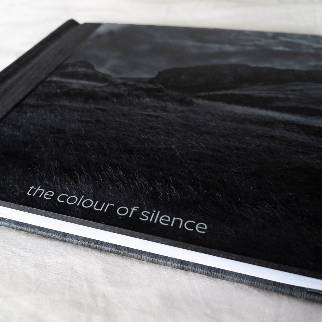
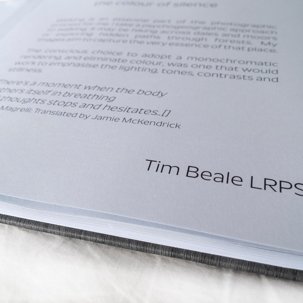
The colour of silence is a three year project that looking at places that hold a significant importance to me in terms of personal space. These journeys I have taken in order to ‘find myself’ both mentally and spiritually. For me, escaping the city and exploring natural environments has is of great benefit to my well being. This project aims to capture the calm and stillness I found in each place. I included selected poems, that have inspired my photography and writings from the Havamal, a book that has had great influence in my spirituality. The choice to omit colour in this work was a conscious effort to allow the viewer to see the beauty of the light as it travels across fields, woodland and through dense vegetation to highlight particular points of interest.

Process
This is one of Saal digital’s professional line photo books. For the layout I used Saal digital’s design software that allows the user to choose all the variants such as paper quality, cover and jacket finish, size format and any additional requirements such as gift box. There are three options for layout; ‘One minute’ have your book created for you by simply uploading images, ‘Auto Layout’ allows you to modify a set layout by dropping in images and text or you can go for the ‘empty layout’ with blank pages to allow total creative freedom. As this was my first book I went for the ‘auto layout’ option but soon found that I had to deactivate the layout settings to allow me to get more creative.
The options I chose for this project were:
- 21 x 21 book
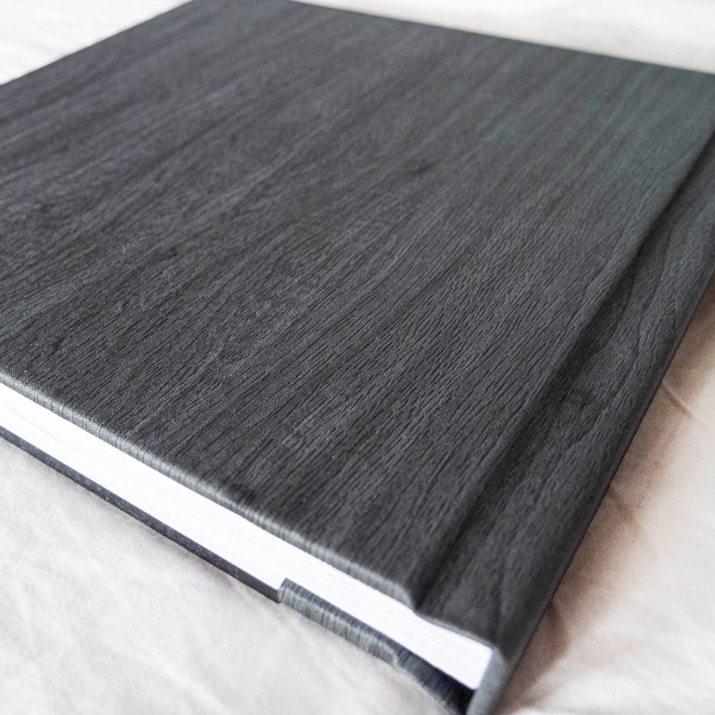
- Acrylic cover with leather binding
- Wood look slate finish to compliment the B&W images
- High end matte paper to reduce glare and offer a crisp contrast to the images
- 56 pages
The process of adding in photos was very easy once the image folder folder is selected your images show up on the left hand side and as you drop your images into the book there is a small icon to show they’ve been used. This is great for avoiding duplicates. With the ability to save a project, this means you can come back to it over time.
Once you have completed your book you can created a PDF sample book that can be printed at home to check the overall layout and colour print. However this will only be a rough guide as printers and paper stock varies between home and factory.

Review
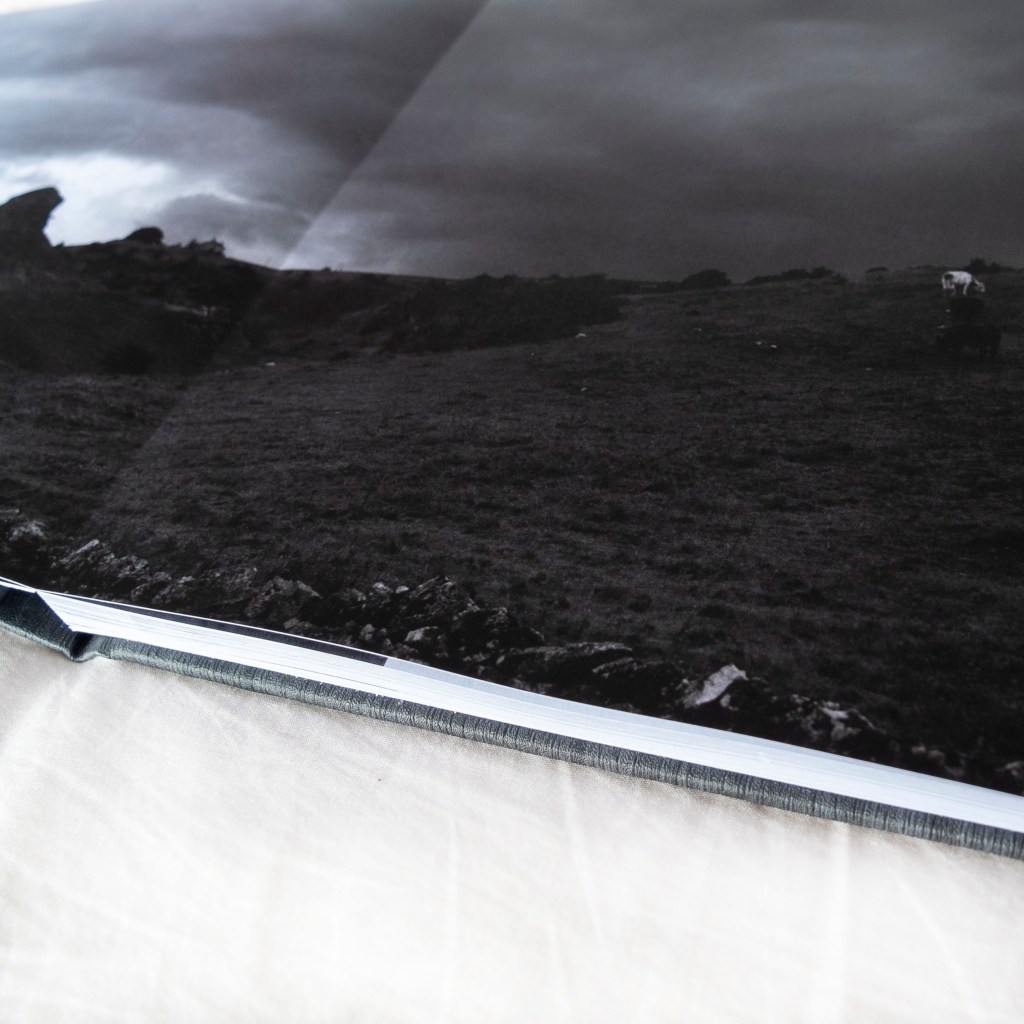
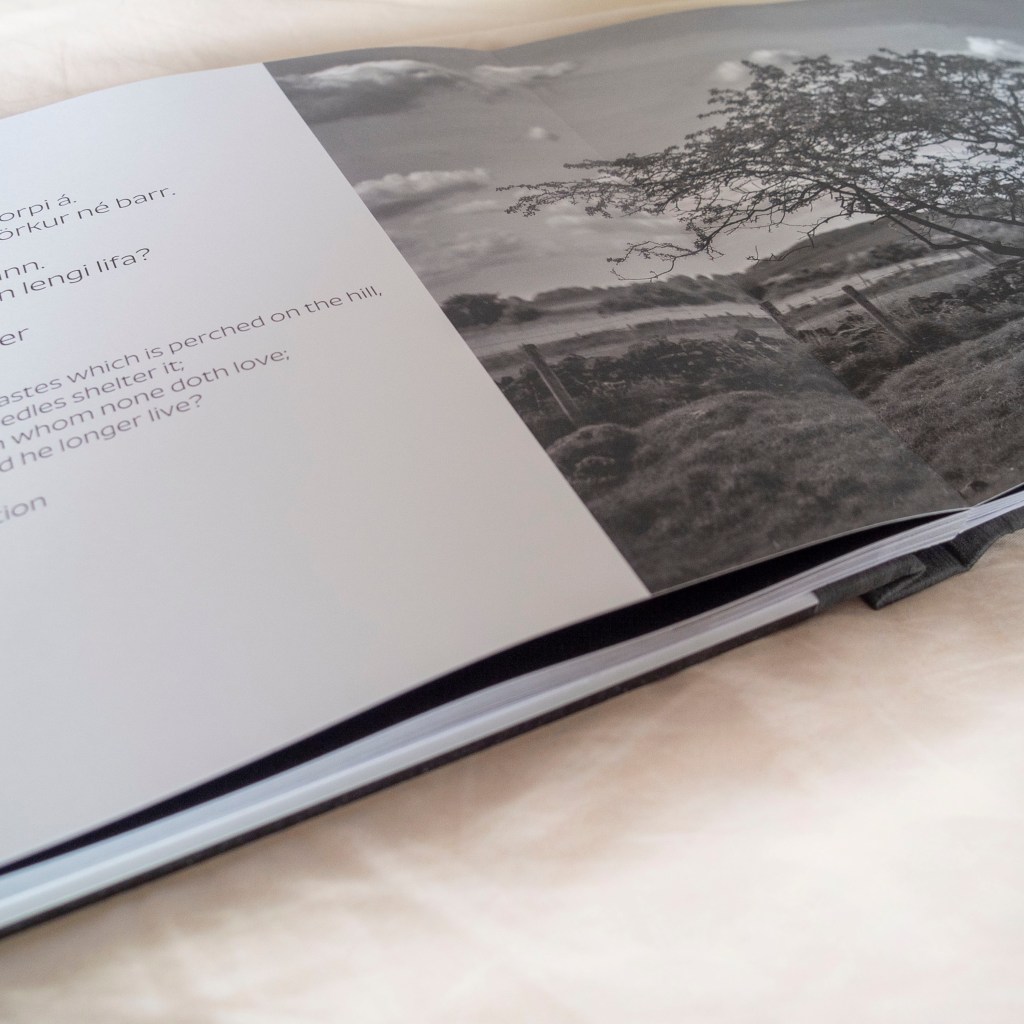
The print run and delivery time took roughly a week, which is pretty astounding. The detail and finish to the book is of a very high quality, which is to be expected for a book costing £100. The binding works really well with double page images, allowing the viewer to find the book completely flat. The high end matte pages are printed beautifully with almost no glare from lighting, even in direct sunlight. This works particularly well for my B&W images as some are very dark.
The acrylic front cover is a great touch however it does have a slight colour cast (grey/green) which actually works for this book. I’m not sure how this would work with a full colour image.
https://www.saal-digital.co.uk/
The whole process from selection of images, text, product specifications was a great learning tool and something I found very enjoyable and rewarding. The photobook has a certain appeal, especially when presented well, that invites the viewer to pick up and spend time with the images inside, more so than an exhibition. As my project progresses there is the temptation to produce a book to accompany the exhibition as a way of taking the viewer on a journey that extends past the walls of the gallery.
