One of the challenges I feel with presenting my practice to a wider audience is ensuring people will want to look and explore the work. The topic of housing inequality and the struggling working class may seem bleak and unappealing to many and will be its own barrier.
As a father I take immense pleasure in reading to my children and seeing what they engage with, what types of books, images and media draw their attention. Pop up books and informative books with lift up flaps have the upper hand when it comes to holding their attention and invite them in to explore the story being told. Taking this as a starting point I looked at how to achieve this with an older audience, whilst creating a visually impactful body of work.
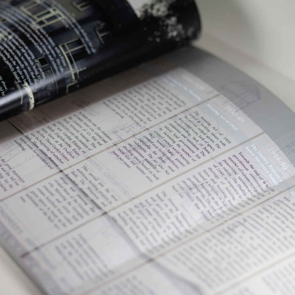
The use of different textures, bold fonts, fold outs and paper weight offer a visual and tactile object that invites the viewer to take their time to explore the book. I deliberately wanted to step away from the standard photobook with its crisp white paper, one image per page with minimal or no text. The main body of information at the beginning of the book is overlayed on top of stylised building plans, the use of strong dark colours contrasts with the white text. The fold out timeline enables the reader to reference the housing policy changes and subsequent changes to the built environs. A second fold out at the back of the book features social media posts depicting the ongoing conversations surrounding the housing crisis.
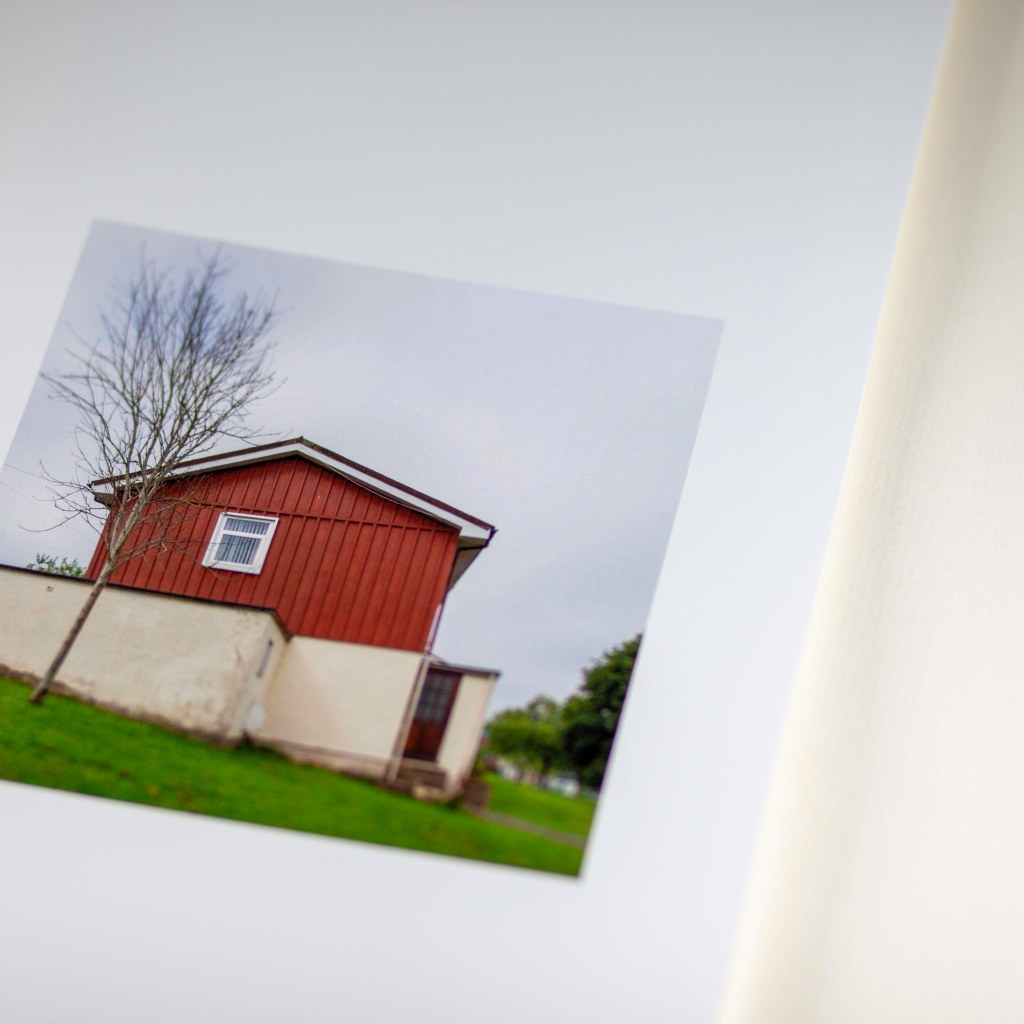
silk white paper used for photographs 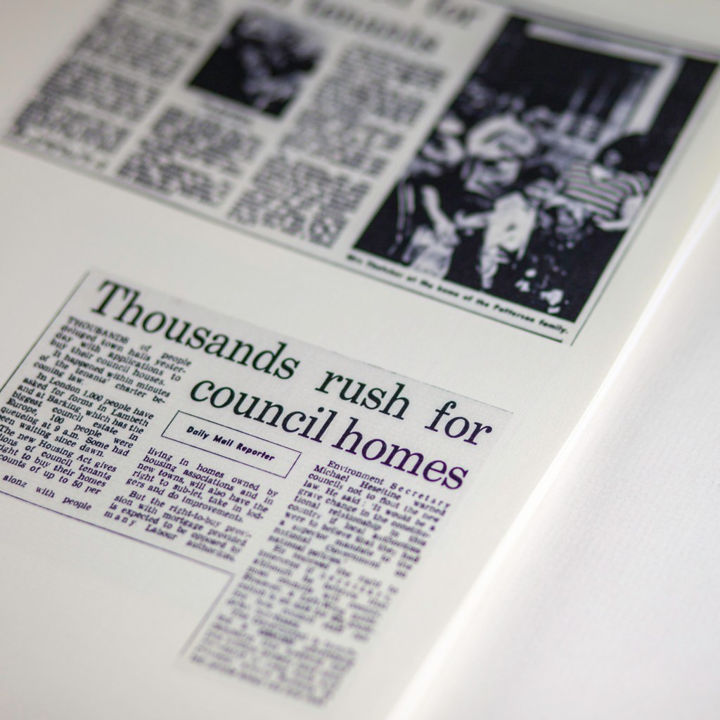
Textured paper has a tactile quality 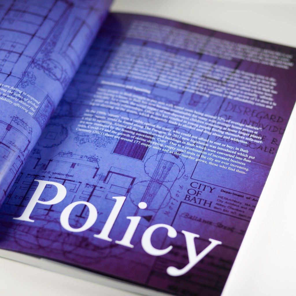
Bold typeface and strong graphic elements is used to give a fresh approach 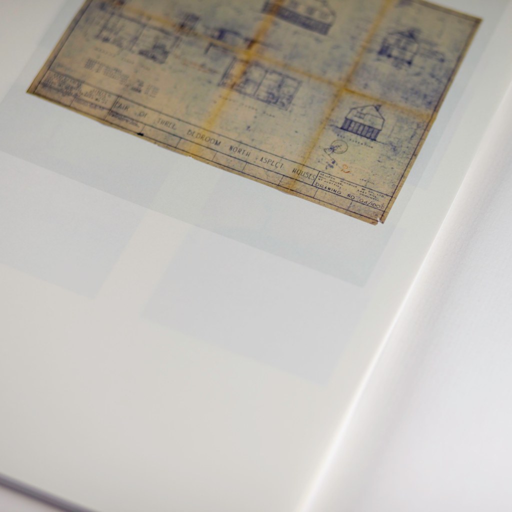
Thin paper stock reminds us of how fragile the past is. The images on the page below are starting to show through
Three paper stocks are used to differentiate between archival objects, newspapers articles and photographs. The use of thin paper stock for the archival objects, mirrors their fragile nature, as the images on the following page start to emerge through the paper. Textured paper is used for newspaper articles to offer a tactile experience, whilst silk 180gsm white paper is used for photographs to offer an honest representation of the subject.
The binding and final finishing of the book is made to resemble the city council contracts that have been issued over the 100-year period my researched covered. This further anchor each photograph to the research within the book. The projected cost of the book, at £45 per book, will limit the audience reach in this format, appealing to a more middleclass audience. A limited print run of 20 copies, the book will appeal to the collector. The next step for this project will be the production of a low-cost zine, aimed at a wider audience. The zine will also give me the opportunity to collaborate with other artists, writers, and photographers.
Images
Figures 1 & 2 from “The Right to This City” self published by Tim Beale 2021
